How to Create a Chat Layout with TailwindCSS and CSS Grid
In this brief article, I'll show you how easy it is to build a chat layout with TailwindCSS using their CSS Grid utility classes.
October 8, 2021 (5y ago)
4 min read
TailwindCSS provides utility classes that enable rapid development and styling of your websites and applications.
In this brief article, I'll show you how easy it is to build a chat layout with TailwindCSS using their CSS Grid utility classes.
Let's go!
The Tech Stack: Next.js & Supabase
Before we continue on, it's important to note that Next.js is being used in conjunction with Supabase to build this chat application.
While the front-end framework and database choices are irrelevant to the styling itself, I use this tech stack to pull messages from the Supabase database and detect if the message belongs to the currently logged in user or not. More on that in a minute.
The Chat App Markup
Let's turn our attention to the markup of the chat application layout. The entire layout is handled in two components: MessageList and Message.
The MessageList Component
A top-level component is needed to be responsible for holding the messages and rendering the list on the page. In the code below, I've created a component called MessageList which queries the database for the messages and lists them on the page in an unordered list, passing each message down to an individual Message component.
MessageList.tsxexport const MessageList = () => {
  const { messages } = useFeed(); // Retrieve messages from database

  return (
    <ul>
      {messages && messages.map((message) => <Message message={message} />)}
    </ul>
  );
};
The Message Component
The Message component simply displays the content passed to it by props and will be styled accordingly.
Message.tsxexport const Message = ({ message }) => {
  const { user } = useAuth(); // the currently logged in user

  function isMessageFromUser() {
    return user?.id === message.user_id;
  }

  return (
    <div>
      <div>{message.message}</div>
    </div>
  );
};
A few things to note:
- The
useAuthhook is used to pull the current logged in user - The
isMessageFromUserhelper function is used to quickly evaluate if the message was sent from the user logged in.
After glancing at the markup above, you may be wondering why we need an extra parent div in the Message component. We need the extra div for styling purposes; more on that in a moment.
Creating the Chat Layout with TailwindCSS and CSS Grid
You know what to expect when it comes to a chat layout. If you're looking at the screen, messages you send are displayed aligned to the right, while any messages sent by others are aligned on the left.
How do we accomplish this with TailwindCSS?
Truth be told, there's a handful of ways to approach this.
We could use margin to fill the empty space. We could even use Flexbox.
In my opinion, however, CSS Grid provides the simplest solution when attempting to create the expected layout of a chat application.
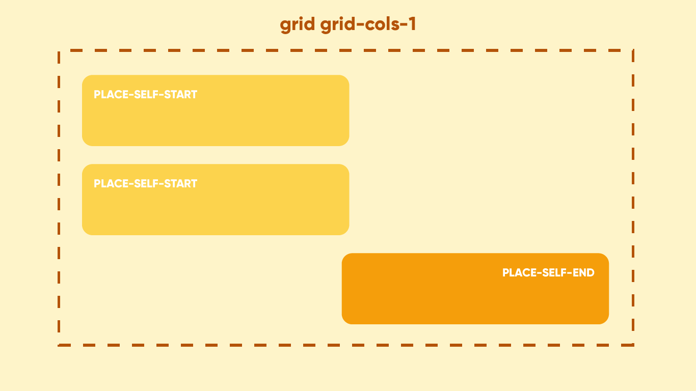
Here's the gist:
- We'll use CSS Grid to target the top-level
ulelement and make it a single-column grid layout. - Next, the child elements (each individual message) will align to the left or right depending on who sent the message. If the current logged in user sent the message, we'll use the
place-self-endutility class to align it to the right. Otherwise, we'll useplace-self-startto align to the left.
Simple, right? Here's a graphic to help reinforce what's going to happen.
Styling the MessageList Component
Following the plan above, all we need to do is target the ul element and apply the following utility classes:
MessageList.tsx<ul className="space-y-12 grid grid-cols-1">
  {messages && messages?.map((message) => <Message message={message} />)}
</ul>
I use space-y-12 to give each message some breathing room on the vertical axis.
That's it! Let's turn our attention to the Message component.
Styling the Message Component
This component requires styles to be applied dynamically; if the user sent a message, it should align on the right, otherwise it should align left.
Remember the isMessageFromUser helper function we created above? This will come in handy so we can make some conditional checks inline and apply utility classes based on the evaluation
Message.tsx<div
  className={`${
    isMessageFromUser() ? "place-self-end" : "place-self-start"
  } space-y-2`}
>
  <div className={`bg-white p-5 rounded-2xl`}>{message.message}</div>
</div>
With that, each message should now align properly!
The Message Feet
To add the finishing touches, let's add the message feet to help reinforce which side the message is coming from. Once again, we ca the helper function to assist with the styling.
Message.tsx<div
  className={`${
    isMessageFromUser() ? "place-self-end" : "place-self-start"
  } space-y-2`}
>
  <div
    className={`bg-white p-5 rounded-2xl ${
      isMessageFromUser() ? "rounded-tr-none" : "rounded-tl-none"
    }`}
  >
    {message.message}
  </div>
</div>
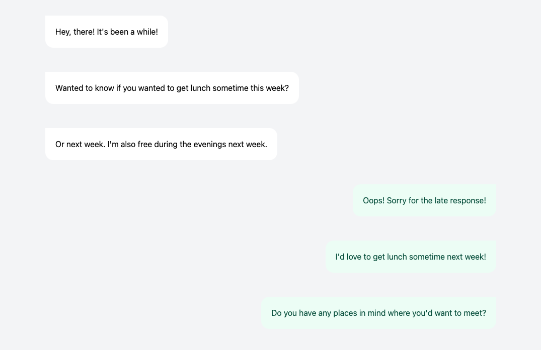
And with that, our chat application looks something like this!
Conclusion
TailwindCSS makes it super easy to style your webpage or application. And while Flexbox may have been your go-to option for a task like this, my hope is that this article demonstrated how easy it can be to create a chat layout with CSS Grid, too!
If you'd like to check out a final version, I've linked a CodePen demo below!
Here are some other articles you might find interesting.

Tailwind Gradients - How to Make a Glowing Gradient Background
In this article, you’ll learn all about Tailwind gradients and how to create the popular glowing gradient effect.

Build a Glassmorphic Navbar with TailwindCSS backdrop-filter & backdrop-blur
TailwindCSS v2.1 brings with it several new utility classes, including filters! Let me show you how I built my website's glassmorphic navbar using TailwindCSS!

Subscribe to my newsletter
A periodic update about my life, recent blog posts, how-tos, and discoveries.
NO SPAM. I never send spam. You can unsubscribe at any time!
