How To Create an Animated Loading Spinner with Tailwind CSS
Tailwind CSS has built-in animation utility classes which enable you to add or create your own custom loading spinners in minutes!
October 4, 2022 (4y ago)
4 min read
Creating loading spinners is an easy task with Tailwind CSS. Regardless if you want to add a built-in animated utility class to a spinner icon or if you want to build a spinner that matches your theme, it only takes a few moments to get set up!
Why Loading Spinners are Important
Our goal as front-end engineers is to make the web fast and beautiful. Sometimes, though, things are out of our control. HTTP calls may take a while to return data, and in those situations, it may be appropriate to show a temporary element to help the user understand the state of their request.
Loading spinners do just that - provide a simple and temporary element to signify a pending state. Without a loading spinner, users may think that their request didn't go through, or that the application or website is broken.
Tailwind Animation Utility Classes
If you're in a hurry and want a loading spinner quickly, Tailwind CSS has built in animation utility classes to help!
Let's look over each animation utility class and discuss the differences between them.
The Bounce Animation Utility
First up is the bounce utility. This specific utility class can be added to an element to make it jump up and down in an infinite loop.
This can be helpful in various situations, such as:
- Update buttons
- Chat icons
- Incoming notifications
- Scroll down indicators
Here's how easy it is to use the bounce utility class:
<svg class="h-6 w-6 animate-bounce ..."><!-- ... --></svg>
The Pulse Animation Utility
Another helpful utility that comes out-of-the-box with Tailwind CSS is the pulse class, providing a smooth fade in and fade out animation on the element.
This can be useful in the following situations:
- Creating a skeleton loader animation when the page loads
- Trying to get the attention of the user if there is an update available
- Loading states
Tailwind makes it easy to implement - here's an example:
<div class="h-32 w-64 animate-pulse rounded-xl bg-white shadow-md"></div>
The Ping Animation Utility
The next animation utility that comes with Tailwind CSS is the ping utility class. This is an extremely helpful animation that scales and fades an element to create an animation that has an extremely satisfying result most commonly found on notification badges.
Depending on your use-case, you may need to duplicate the element you want to animate because the ping animation will alter the element on which it is applied.
Once again, the activate this animation, simply apply the utility class to your element:
<!-- Duplicated element with ping utility -->
<div
  class="absolute -left-3 -top-3 h-8 w-8 animate-ping rounded-full bg-indigo-500"
></div>

<div class="absolute -left-3 -top-3 h-8 w-8 rounded-full bg-indigo-500"></div>
The Spin Animation Utility
Finally, Tailwind CSS provides the spin utility class which rotates an element with a linear animation. This specific utility comes in handy with loading spinners!
<svg class="h-12 w-12 animate-spin text-indigo-400" viewBox="0 0 24 24">
  <!-- ... -->
</svg>
The example above uses an SVG from Iconic, but let's look at how to build a custom loading spinner with pure Tailwind CSS!
Building a Custom Loading Spinner with Tailwind CSS
Building a custom loading spinner can be as simple as adding a few elements to the DOM.
First, create a div, make it a fully rounded circle and feel free to apply a width and height that suits your specific use-case.
<div class="h-14 w-14 rounded-full"></div>
In order to make it look like the loader is spinning, we need some form of visual variation. We'll achieve this with a gradient. Feel free to choose your own colors, but here's what I've opted to use:
<div
  class="h-14 w-14 rounded-full bg-gradient-to-tr from-indigo-500 to-pink-500"
></div>
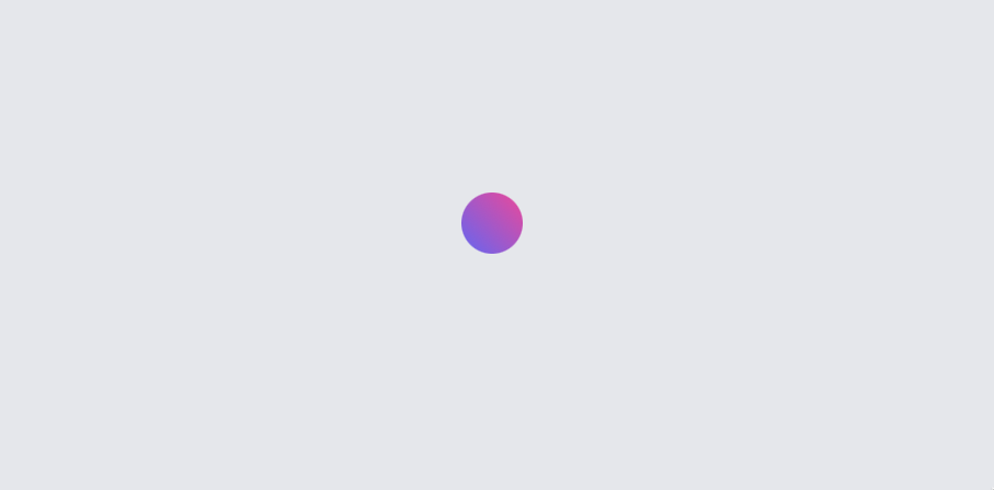
Next, we want to transform this element into a ring. One way to do that is to place a smaller circle inside and match the background color.
<div
  class="h-14 w-14 rounded-full bg-gradient-to-tr from-indigo-500 to-pink-500"
>
  <div class="h-9 w-9 rounded-full bg-gray-200"></div>
</div>

The only issue is that the inner circle is not center. That's an easy fix with the Tailwind CSS flexbox utility classes!
<div
  class="h-14 w-14 items-center justify-center rounded-full bg-gradient-to-tr from-indigo-500 to-pink-500"
>
  <div class="h-9 w-9 rounded-full bg-gray-200"></div>
</div>

The last step is to animate the circle with the gradient applied. Again, Tailwind CSS makes this extremely easy! Just add animate-spin to the element, and now we've got a beautiful loading spinner!
Conclusion
In this article, we explored the various animation utility classes that Tailwind CSS provides and briefly saw some real-word examples. Using the animate-spin utility class, we created a custom loading spinner that is completely customizable - all thanks to Tailwind CSS!
Here are some other articles you might find interesting.

Tailwind Gradients - How to Make a Glowing Gradient Background
In this article, you’ll learn all about Tailwind gradients and how to create the popular glowing gradient effect.

How to Create a Chat Layout with TailwindCSS and CSS Grid
In this brief article, I'll show you how easy it is to build a chat layout with TailwindCSS using their CSS Grid utility classes.

Subscribe to my newsletter
A periodic update about my life, recent blog posts, how-tos, and discoveries.
NO SPAM. I never send spam. You can unsubscribe at any time!
