Web Development Concepts in SwiftUI
If you're a front-end developer interested in building your own iPhone or iPad apps, this article is for you. My goal is to take front-end concepts that you already know and show you the equivalent concepts in SwiftUI.
October 9, 2020 (6y ago)
7 min read
Introduction
As developers, we express ourselves through what we create. If you're like me, then you know the addictive nature of creating beautiful pixel-perfect websites from markup, CSS and maybe even a bit of JavaScript. It's what gets me out of bed in the morning. That, and Dr. Pepper. 🥤
When Apple announced SwiftUI at WWDC in 2019, I knew I wanted to get back into mobile development. Yes, I've used Ionic and React Native in the past and while both provide solutions to certain problems, they each have their own drawbacks. I was eager to experience Apple's attempt at creating their own UI framework, and when I finally jumped in, I wasn't disappointed. Yes, the current state of SwiftUI leaves some things to be desired, but the future is very promising.
If you're a front-end developer interested in building your own iPhone or iPad apps, this article is for you. My goal is to take front-end concepts that you already know and show you the equivalent concepts in SwiftUI.
Are you excited? I am! Let's go!
What is SwiftUI?
Before we dive into some code, let's first define SwiftUI and the role it plays in your application development.
According to Apple,
InfoSwiftUI provides views, controls, and layout structures for declaring your app’s user interface. The framework provides event handlers for delivering taps, gestures, and other types of input to your app, and tools to manage the flow of data from your app’s models down to the views and controls that users will see and interact with.
SwiftUI is declarative in nature, meaning that we tell SwiftUI how our user interface should look at different states in our application and it takes care of the rest. It's a little more involved than that, but you get the basic idea.
Front-End Concepts in SwiftUI
Views
Views are the building blocks of your mobile application. Just like Components in modern JavaScript frameworks, Views are slices of your application that define bits of your user interface. Everything that you see and interact with inside of your mobile application will be built using Views.
IdeaThe mental link? Views are essentially Components.
SwiftUI has many built-in Views that we can use right out of the box, but let's take a look at one I created.
struct CustomView: View {
    var body: some View {
        Text("Hello, World!")
    }
}
This is the basic structure of a View in SwiftUI; a struct that conforms to the View Protocol. To get a little more technical, the View Protocol is simply a type that represents part of the user interface and allows you to alter the way it is presented using Modifiers. More on those later. The View Protocol requires a property called body that contains the layout for that View. In the example above, the CustomView simply displays "Hello, World!" on the screen.
Stacks
Now that we know about Views, let's turn our attention to Stacks in SwiftUI.
Stacks provide the foundation for your layouts and can be thought of as containers. SwiftUI provides three stacks that help align items in your view:
- Horizontally, using the HStack
- Vertically, using the VStack
- Layered on the z-axis, using the ZStack (which I won't be covering in this article)
HStack
An HStack (Horizontal Stack) allows you to place (or stack, hence the name) two or more Views side by size on a horizontal axis.
Here's an example.
struct HStackExample: View {
    var body: some View {
        HStack {
            Text("Left Side")
            Text("Right Side")
        }
    }
}
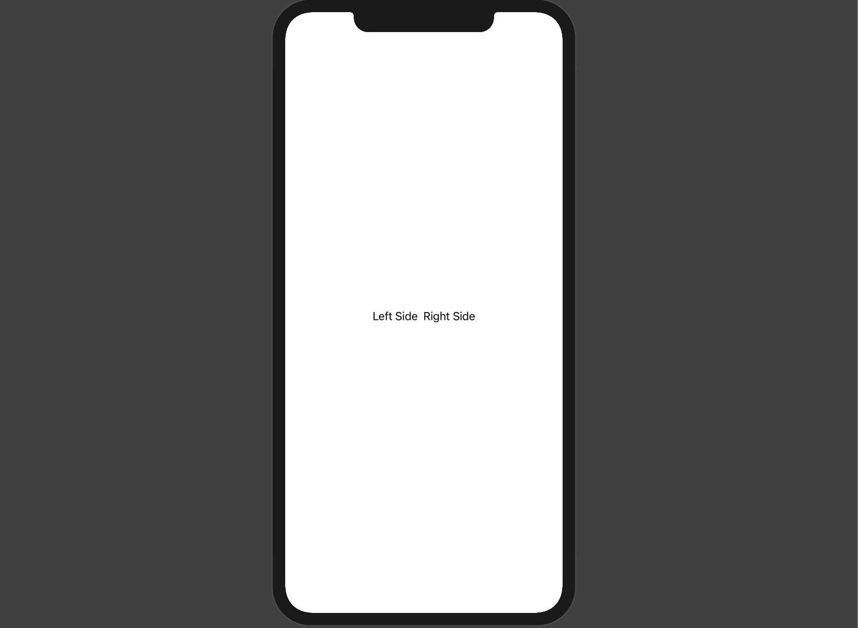
By default, an HStack determines its width by the Views inside it.
IdeaThe mental link? An HStack provides the same default functionality that we get when we set up a
flex-container.
// HTML

<div class="flex__items">
    <p>Left Side</p>
    <p>Right Side</p>
</div>

// CSS

.flex__items {
  display: flex;
}

We get almost exactly the same thing, right? If you have a good eye, you'll notice that the SwiftUI example has a bit of space between the two Text Views. That's because, by default, an HStack has some spacing applied. To achieve the same effect in web development, you have to add some margin via CSS.
We can change the spacing value when creating the HStack and make it match the web development example.
HStack(spacing: 0) {
     Text("Left Side")
     Text("Right Side")
}
VStack
A VStack (Vertical Stack) allows you to place two or more Views on top of each other.
Here's an example.
struct VStackExample: View {
    var body: some View {
        VStack {
            Text("On Top")
            Text("On Bottom")
        }
    }
}
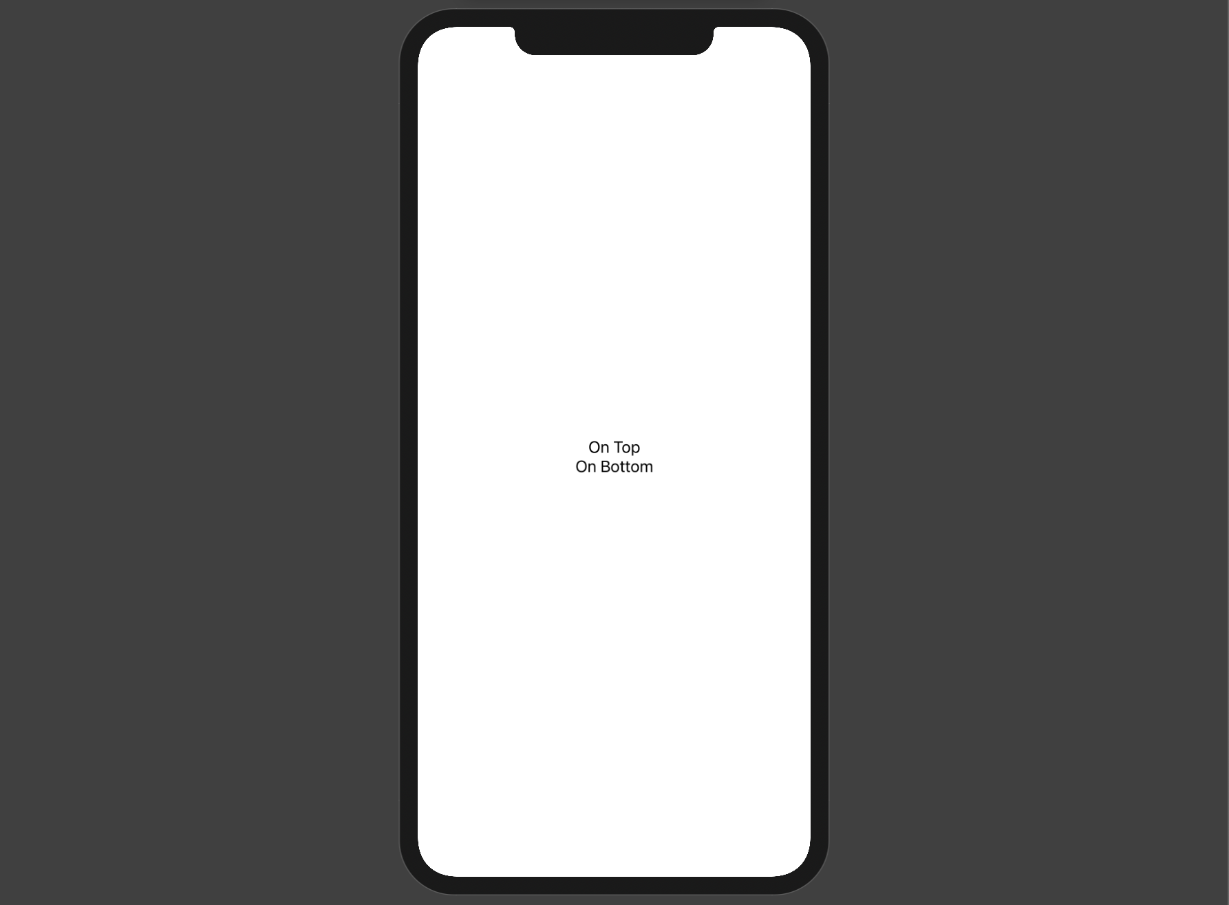
By default, Views inside a VStack are centered which is extremely convenient.
IdeaThe mental link? A VStack provides the same default functionality that we get when we create a flex-container, set
flex-directiontocolumn, andalign-itemstocenter.
.flex__items {
  display: flex;
  flex-direction: column;
  align-items: center;
}
Pretty cool, right?
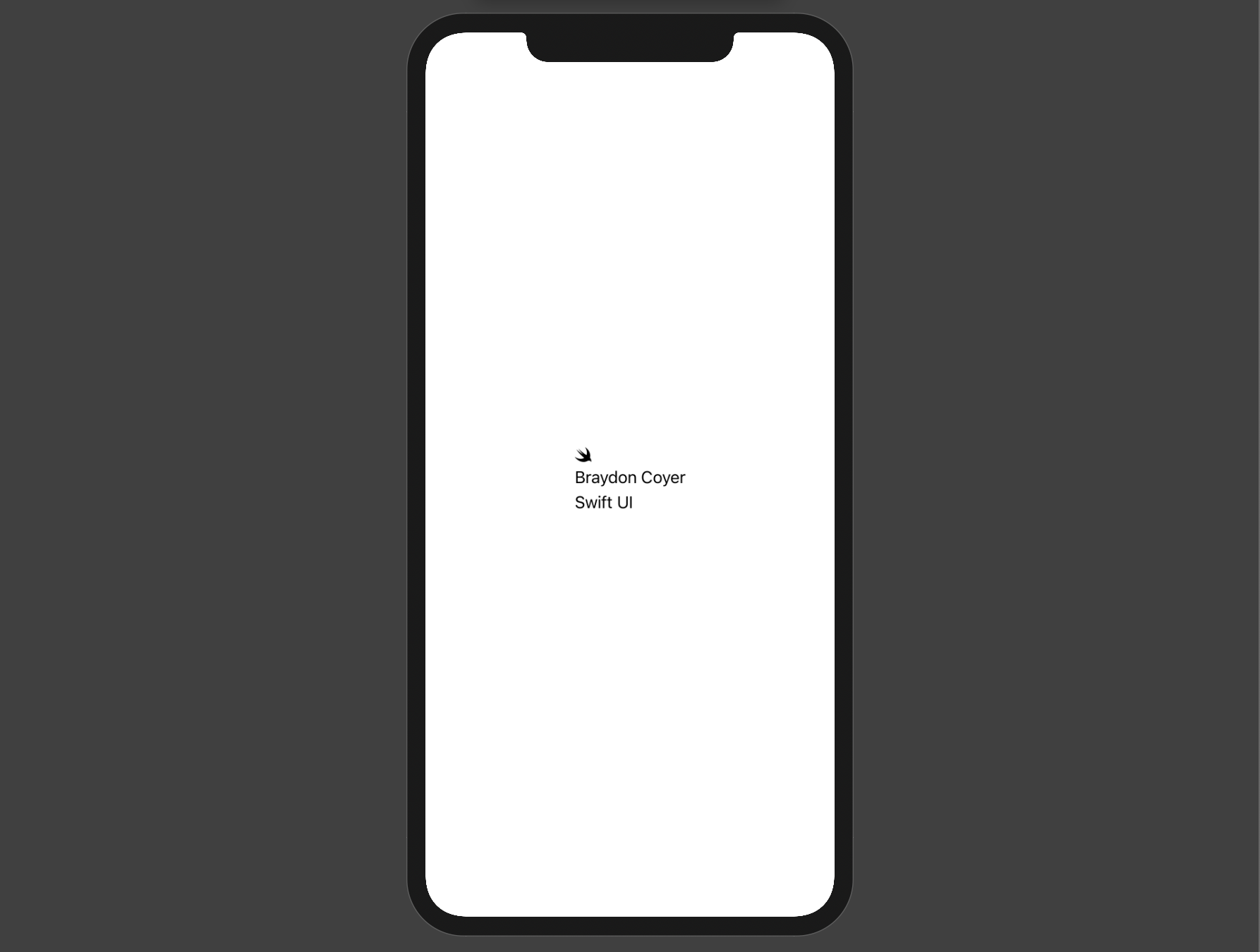
VStacks are highly customizable, too - we can control the alignment of the items in the container, spacing between the Views inside the stack, and more.
VStack(alignment: .leading, spacing: 5) {
     Image(systemName: "swift")
     Text("Braydon Coyer")
     Text("Swift UI")
}
Spacers in SwiftUI
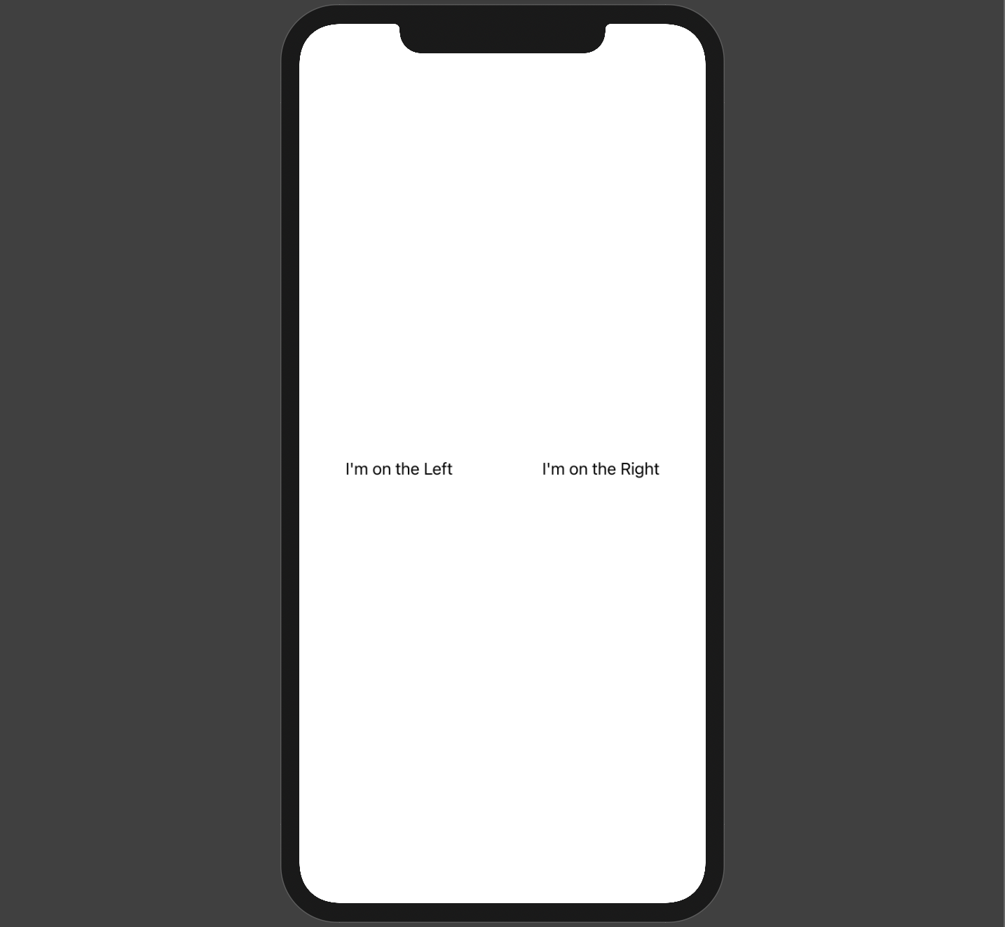
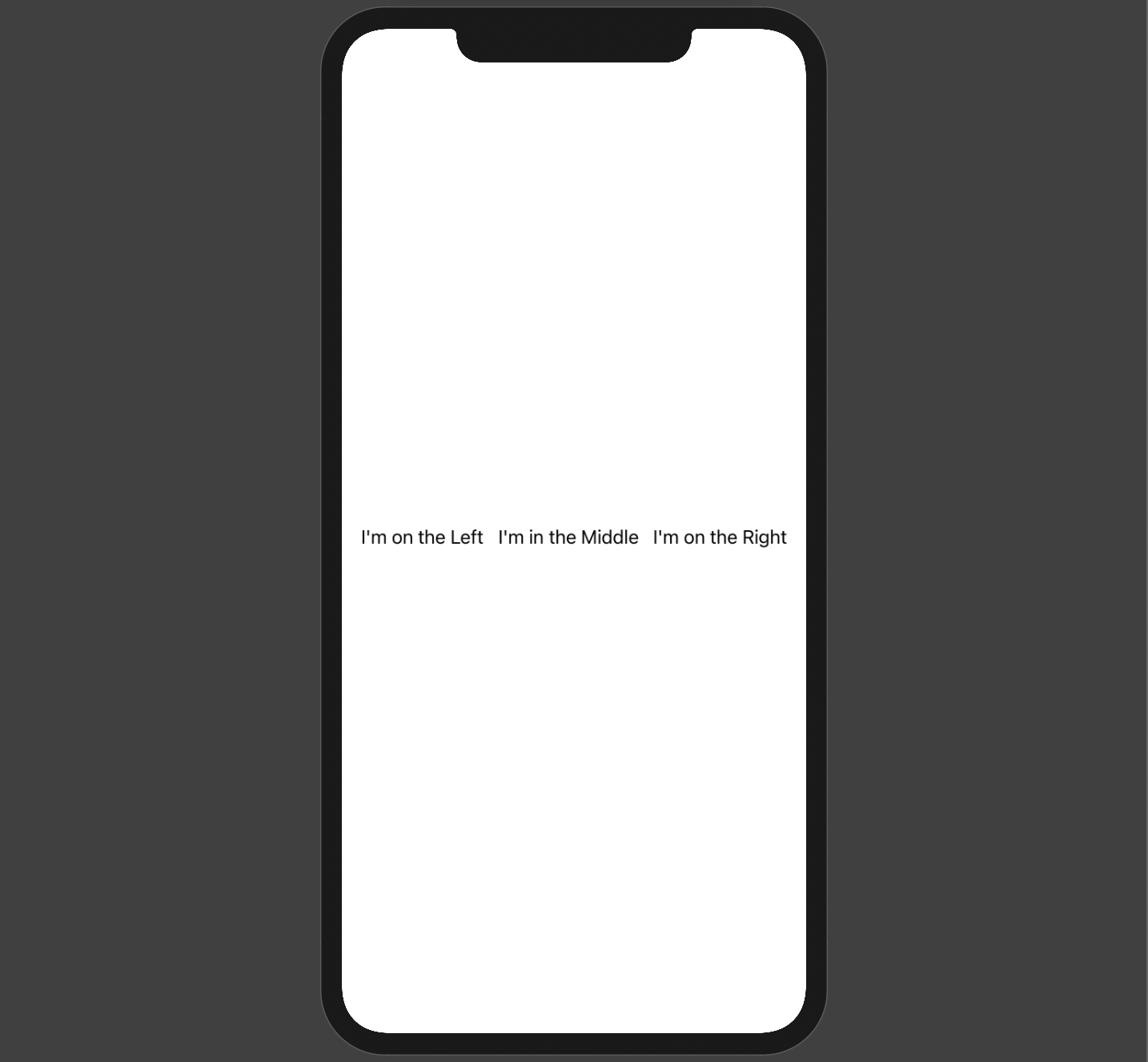
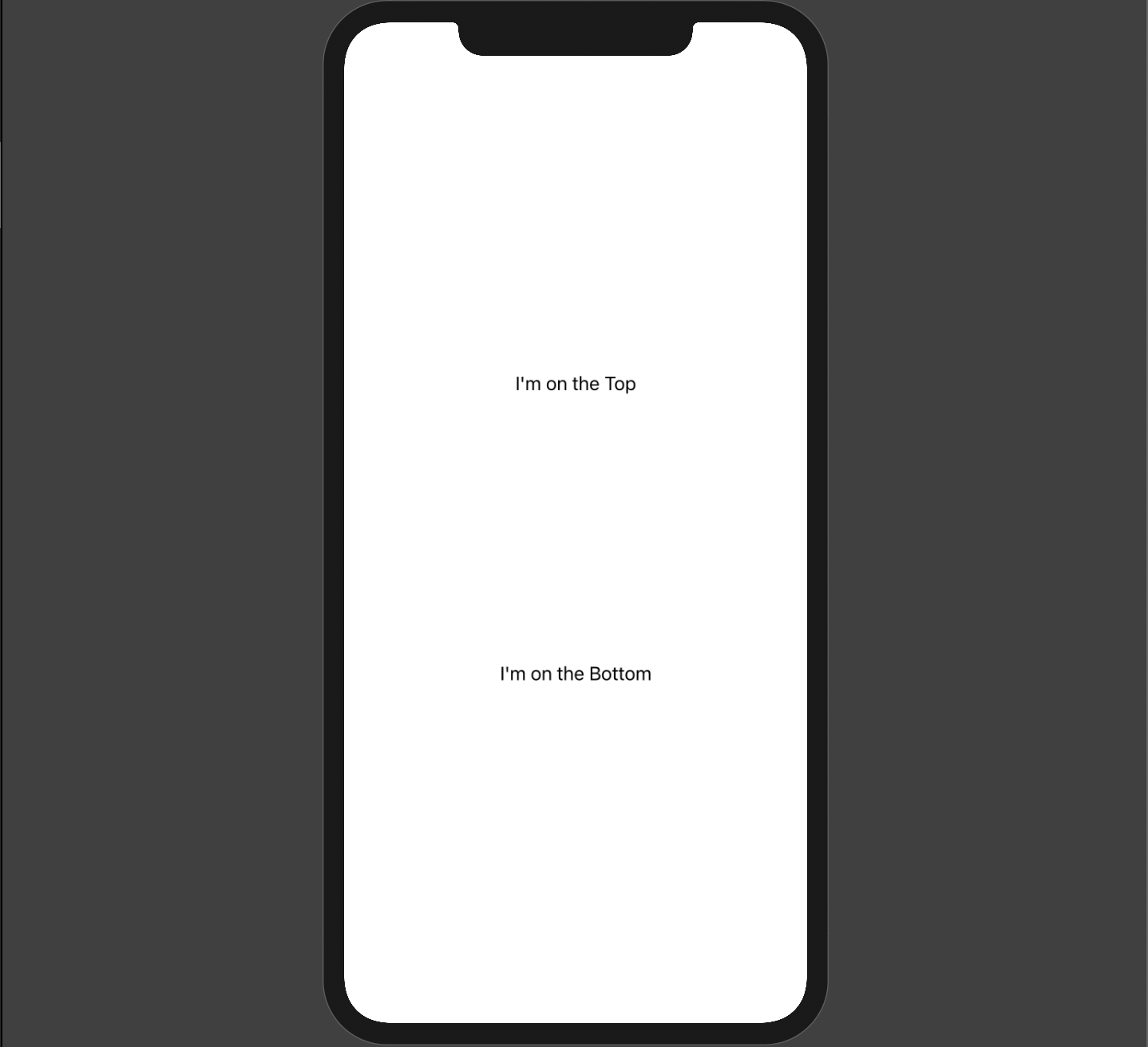
Spacers are one great example of the declarative nature of SwiftUI. Spacers push Views along the major axis of its parent Stack. There really isn't a CSS equivalent by itself, but combining Spacers with Stacks allow us to create more complex layouts with relative ease.
Here are a few examples that achieve various layouts using Flexbox and the justify-content property.
HStack() {
     Text("I'm on the Left")
     Spacer()
     Text("I'm on the Right")
}
HStack() {
     Text("I'm on the Left")
     Spacer()
     Text("I'm in the Middle")
     Spacer()
     Text("I'm on the Right")
}
VStack() {
     Text("I'm on the Top")
     Spacer()
     Text("I'm on the Bottom")
}
VStack() {
     Text("I'm on the Top")
     Spacer()
     Text("I'm in the Middle")
     Spacer()
     Text("I'm on the Bottom")
}
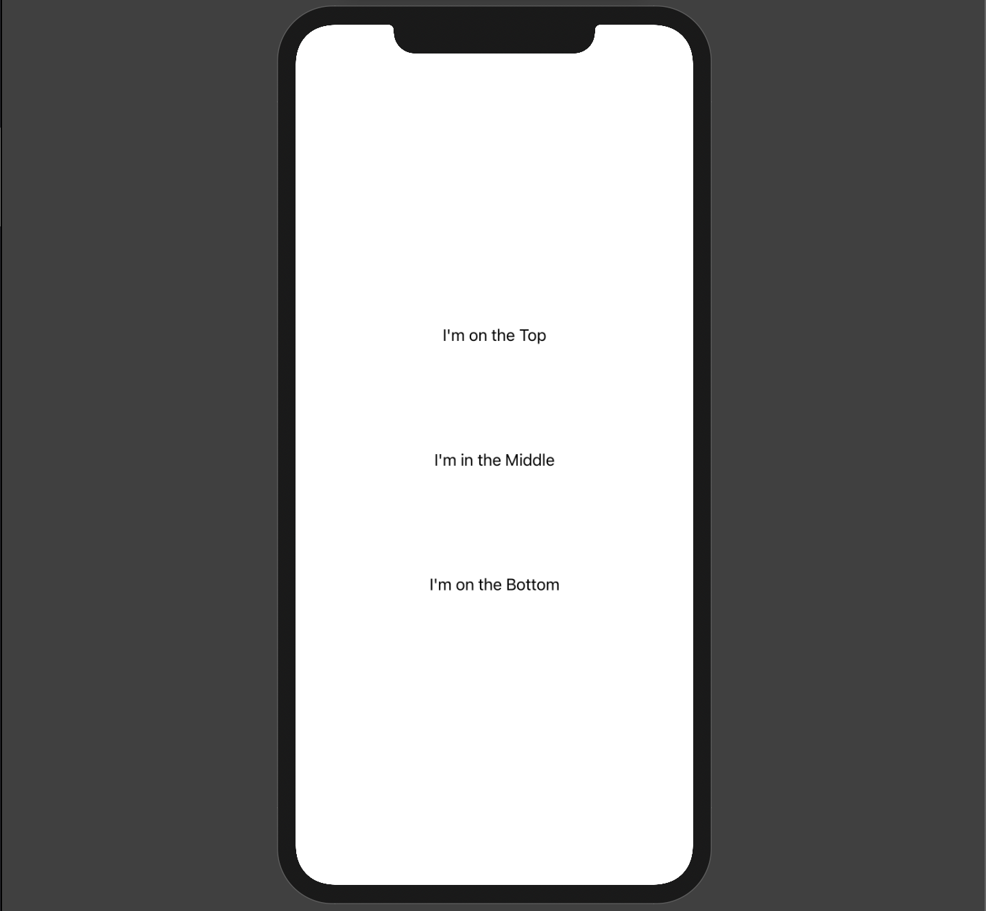
InfoWith all of the examples above, I changed the size of the Stack container so things appear in a more visually-pleasing format. In order to change the size of a Stack, you need to attach a Modifier.
Modifiers
Modifiers are another foundational concept in SwiftUI. They wrap Views and are chained vertically to change how a View is displayed. Modifiers return a new View, which is why Modifiers are stacked; each Modifier is applied to the View returned from the previous Modifier. This means that the order of the Modifiers is important, but I won't be expounding on that more in this article.
Conventionally, we usually don't put Modifiers in the definition of our custom Views, but rather allow the consumer to determine the look of the View.
IdeaThe mental link? Modifiers change the look of a View, much like we'd use CSS properties to change things like font color, width, height, z-index and padding of DOM elements.
Let's take a look at some examples.
struct HStackExample: View {
    var body: some View {
        HStack() {
            Circle()
                .frame(width: 40, height: 40)
                .foregroundColor(.blue)
            Text("Profile")
                .font(.title)
                .fontWeight(.bold)
        }
    }
}
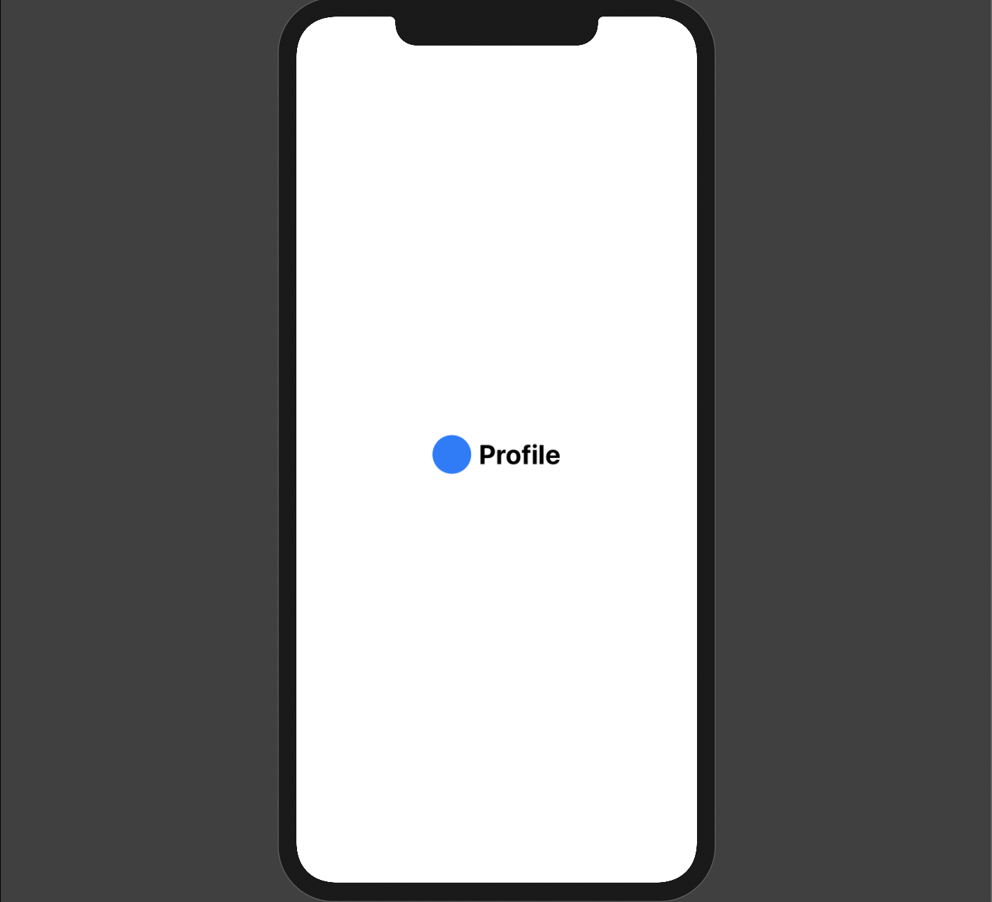
The code above creates an HStack and has two Views inside of it - a Circle and a Text View which displays "Profile".
Notice the Modifiers.
In the Circle, the frame() Modifier sets a size for the View. I also changed the color of the Circle using the foregroundColor() Modifier.
On the Text View, I use the font() Modifier to bump up the font size. I also make the text bold by using the fontWeight() Modifier.
As you can see, SwiftUI's declarative nature makes reading this code a breeze, and it's also not hard to figure out how to style your Views because of the easy-to-understand syntax.
Conclusion
While we have only scratched the surface of SwiftUI, I trust this article has been helpful in understanding how common font-end concepts translate over to Apple's new UI Framework. In many cases, SwiftUI makes it much easier to build complex layouts, and since we only have to write our code once and it pretty much works across all of Apple's device ecosystem, it's a win-win.
While there are downsides to SwiftUI, the future is very bright. Within a few years, I can see many Swift frameworks (UIKit, SceneKit, etc) being fully integrated into SwiftUI which will only speed up development and make all of our lives easier.
If you want to learn more about SwiftUI, I highly recommend checking out Apple's Landmark tutorial series. Take it slow, and have fun!
Thanks for reading! If you liked this article and want more content like this, read some of my other articles, subscribe to my newsletter below and make sure to follow me on Twitter!
Here are some other articles you might find interesting.

Build Link Previews with Playwright and the Popover API
Wikipedia-style link previews can make your blog feel more polished. In this tutorial, we'll build a system that captures screenshots at build time and displays them using the native Popover API with smooth CSS animations.

A Modern Table of Contents in Next.js with CSS Anchor Positioning
In this tutorial, you'll learn how to build a floating table of contents component for your Next.js blog that tracks the reader's scroll position and highlights the active section with a smooth animated dot.
Subscribe to my newsletter
A periodic update about my life, recent blog posts, how-tos, and discoveries.
NO SPAM. I never send spam. You can unsubscribe at any time!
