8 Tips To Improve Your UI Designs
Many developers claim they don't have an eye for design, but just like with anything, skills improve with practice. In this article, I want to share 8 design tips that have helped me as a developer. Hopefully they help you, too!
November 5, 2020 (6y ago)
5 min read
Design. Does it scare you?
While it's not mandatory for front-end developers to design user interfaces, I don't believe it's something we should shy away from either.
Many developers claim they don't have an eye for design, but just like with anything, skills improve with practice.
In this article, I want to share 8 design tips that have helped me as a developer. Hopefully they help you, too!
Most ( if not all ) of these tips are pulled from free sections of Refactoring UI - an amazing toolbox of UI tips from a developer's perspective written by the makers of TailwindCSS.
Tip #1
Use color and weight to create hierarchy instead of size.
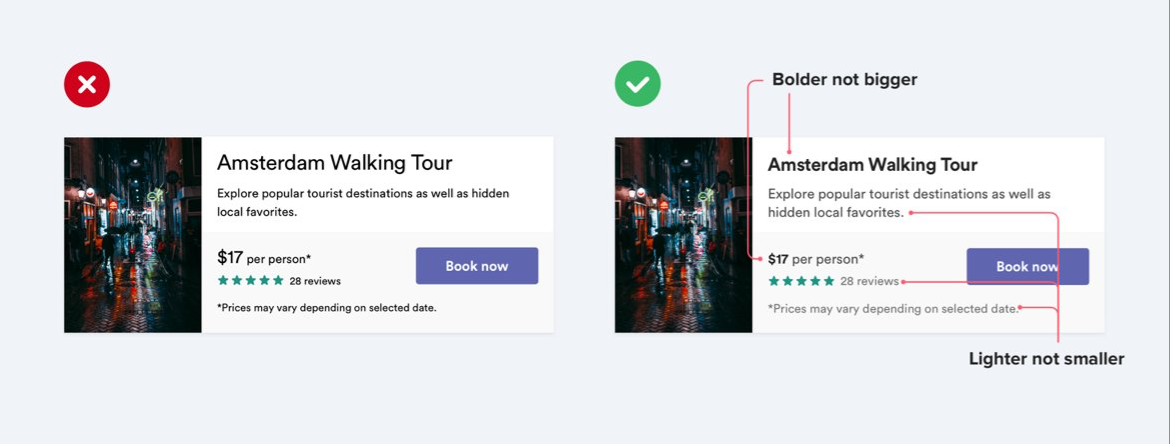
I struggle with this one. I have a tendency to up the size of elements (usually text) to convey the importance.
Instead, tinker around with font-weight and color. Notice how by bolding the title text and changing some font color the card on the right feels more uniform and less claustrophobic.
Tip #2
Don't use grey text on colored backgrounds.
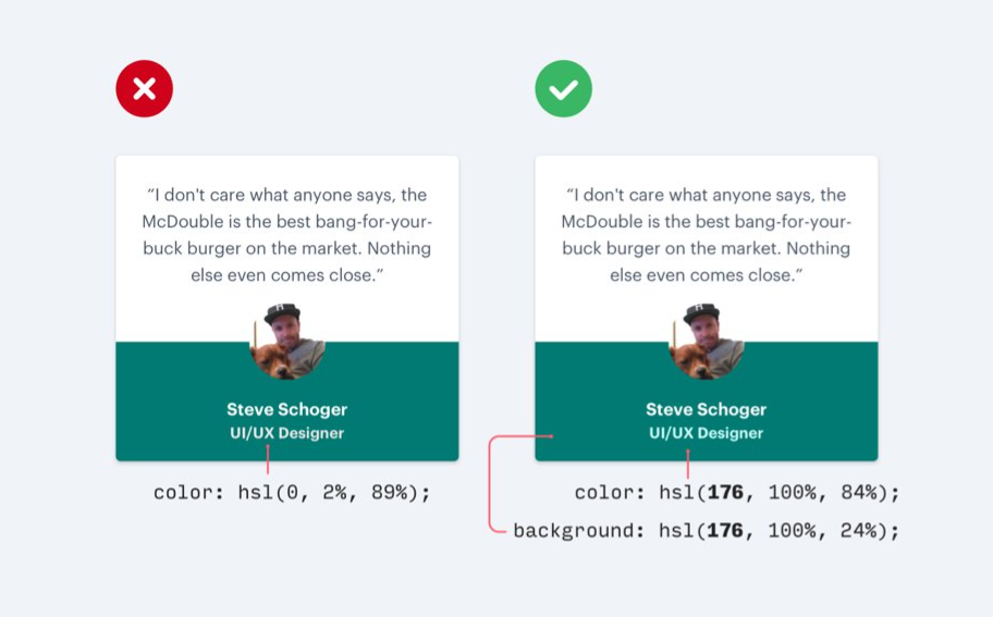
On the left the user's title is a tone of grey. While it doesn't look 'bad' by itself, notice how changing the color to a light-green, complementing the dark-green background, improves readability and also establishes hierarchy.
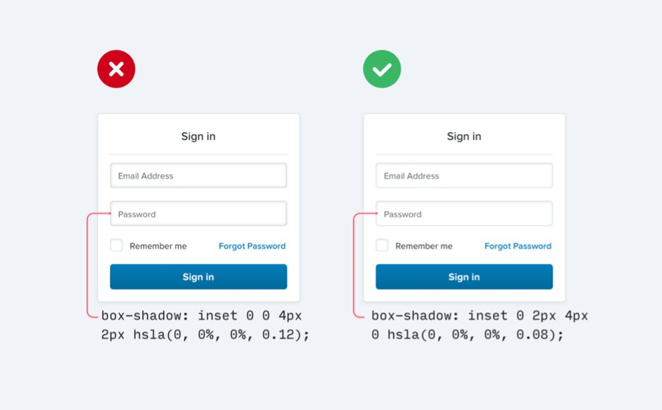
Tip #3
Offset shadows.
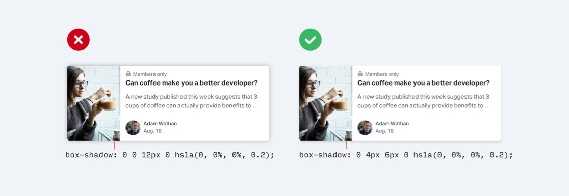
Instead of placing a shadow with a large spread around a parent element, offset the shadow and use smaller spreads. Keep in mind that the shadow placement allows your users to (often unconsciously) determine the light-source in your user interface. Be consistent so you don't break the effect.
You can use shadows on inner elements, too!
Tip #4
Use fewer borders - please! This concept builds on some of the previous tips.
A natural instinct is to use borders to define separation between elements or segments of an element, or to use borders to outline elements and make them pop from background components of the user interface.
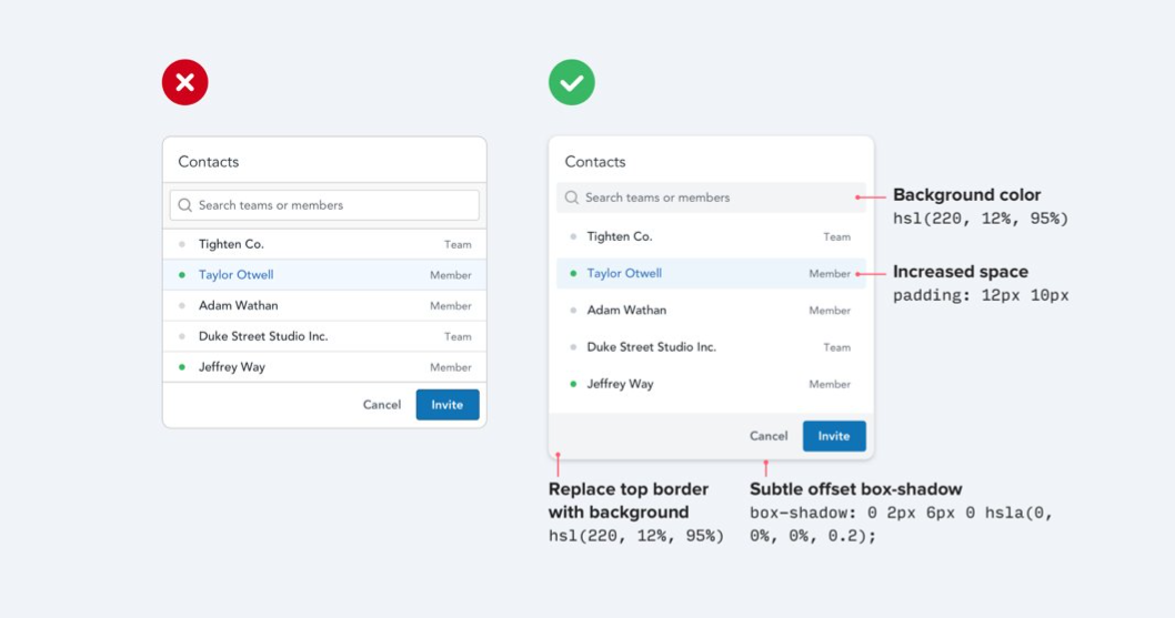
Instead of using borders to outline elements, revert to a subtle shadow with an offset.
Instead of using borders to define separation, use white-space or a different background color.
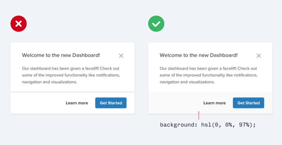
With this simple revision, elements will feel less claustrophobic and look less like design trends from 10 years ago.
Tip #5
Don't blow up icons that are meant to be small.
White-space can be a pain. Sometimes it's good and helps readability, but other times it can feel like a void that needs to be filled. I've found this to be true when dealing with icons inside other elements and I often blow them up to a larger size to fill the gap.
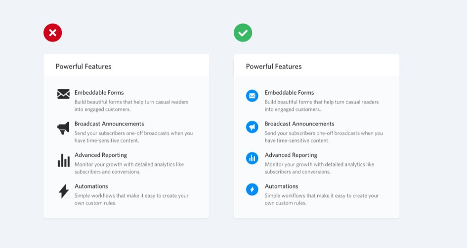
Instead of trying to increase the size of an icon to occupy space, try placing the icon in another shape with a secondary color.
Tip #6
Use accent borders to add color to a bland design.
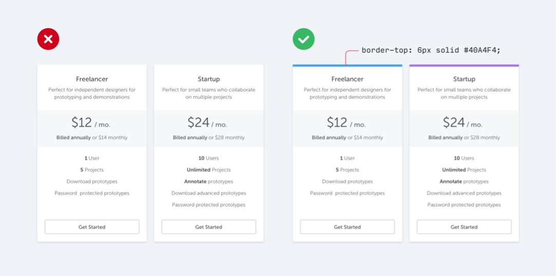
We've all been there. We look at something we designed and think:
It's too white and bland. This is boring to look at. I need to add some color.
I tend to go overboard and add too much color and before I know it, the background of a card is colored with a primary hue and the entire design looks off.
Often times, less is more. Instead of going overboard, simply add an accent-colored border to an element. It doesn't overwhelm the design, but manages to remedy the bland-look.
Tip #7
Not every button needs a background color.
This one is huge and is something I think we pick up from old design-tends. Always including a background color for your buttons can confuse the user from the most important actions in your user interface.
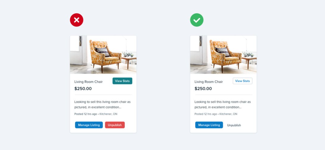
Instead of always using a primary, secondary or tertiary background color, allow less-important buttons to breath a bit.
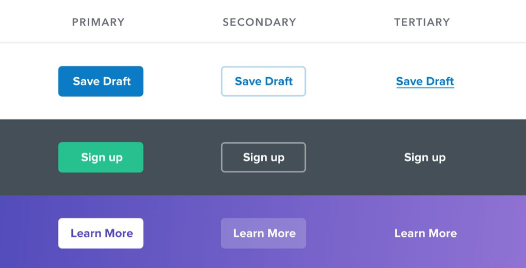
Here are a few rules from Steve Schoger to help you decide how to style your buttons:
- Primary actions should be obvious. Solid, high contrast background colors work great here.
- Secondary actions should be clear but not prominent. Outline styles or lower contrast background colors are great options.
- Tertiary actions should be discoverable but unobtrusive. Styling these actions like links is usually the best approach.
Here are a few examples:
Tip #8
Think outside the database.
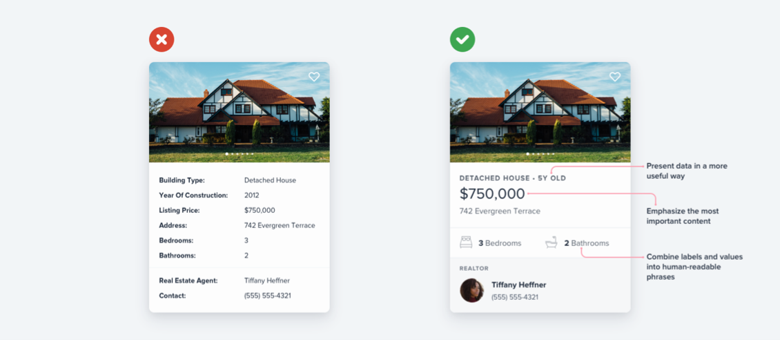
As developers, it's easy for us to take an object of data that we retrieve from the back-end and slap the values onto the UI. There isn't any creativity, and designs end up looking very tabular.
Instead, don't be afraid to present data in a more useful way, emphasize the most important content and to combine labels and values into human-readable phrases.
Conclusion
Designing may scare you, but it doesn't need to scare you. Yes, designers go through many years of learning to understand theory and all of the other things it takes to build user interfaces that present great user experiences, but as developers, we can design with tactics if we lack the talent.
My hope is that these 8 tips help you identify small changes that you can make and greatly improve your designs.
For more tips and tricks like these, make sure to check out RefactoringUI!
Thanks for reading! If you liked this article and want more content like this, read some of my other articles and make sure to follow me on Twitter!
Here are some other articles you might find interesting.

Great Software Teaches Great Taste
In an era where AI agents can write software faster than we can, the quality that may ultimately distinguish us isn't our technical skill, but our creative taste.

6 BEST Fonts for Programming in 2022
In this article, I share the top 6 best fonts to use for programming in 2022!

Subscribe to my newsletter
A periodic update about my life, recent blog posts, how-tos, and discoveries.
NO SPAM. I never send spam. You can unsubscribe at any time!
